Tuesday, April 19, 2011

Concept Map

Concept Map- a diagram showing the relationships between words and ideas using boxes, arrows, and other figures. 


A concept map is used to see the structure of information, to organize and represent knowledge. They frequently use words and symbols to convey relationships in information. The map above is a concept map about concept mapping- it shows the purpose and structure of concept maps, as well as other information relevant to these maps. 

Bathymetric Map

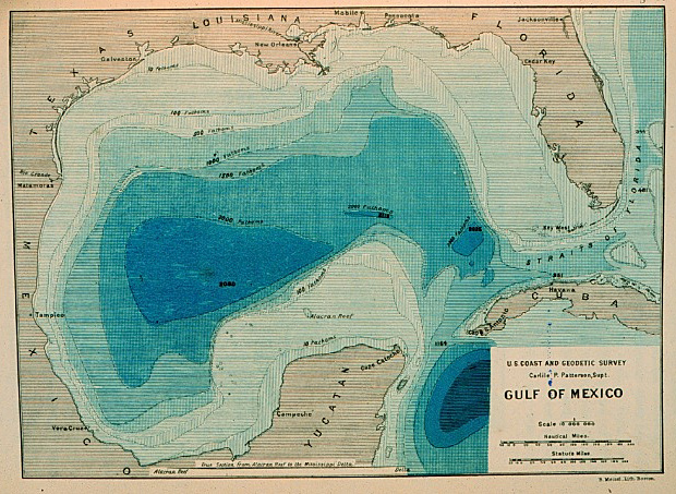
Bathymetric Map- a map of the sea-bed surface showing depths below sea level. 


Bathymetric maps are similar to surface topography maps. This map shows the first realistic bathymetric map of any ocean basin, created between 1873 and 1875 in the Gulf of Mexico. 

Bilateral Graph

Bilateral Graph- a graph that shows the changes in two related variables. 


A bilateral graph is often used to show how the changes in one variable affect the changes in another. They can show both negative and positive changes. This bilateral graph shows the relationship between gas prices and consumer spending during 2007. Just after gas prices rose in May, spending went down, but spending rose as gas prices rose in November, presumably in anticipation of Christmas. 

Correlation Matrix

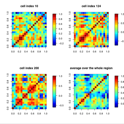
Correlation Matrix- a matrix or table showing the inter-correlations between all variables. 


A correlation matrix shows the similarities between all variables of a study. These matrices show the correlations between 20 climate models in four different areas. Each row and column of the matrix is a model, and the colors indicate how the models are similar or dissimilar to each other. 

Monday, April 18, 2011

Lorenz Curve

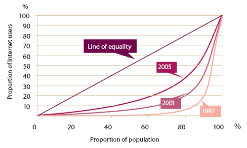
Lorenz Curve- a graph in which the cumulative percentage of a variable is plotted against the cumulative percentage of the corresponding population. The extent to which the curve falls below the equality line indicates the inequality of the distribution. 


A Lorenz curve indicates the inequality of a distribution. This graph shows the proportion of internet users to the total population. The straight diagonal line is the line of equality. The curves below it correspond to different years. As you can see, the proportion of internet users is becoming increasingly more equalized from 1997 to 2005. 

Parallel Coordinate Plot

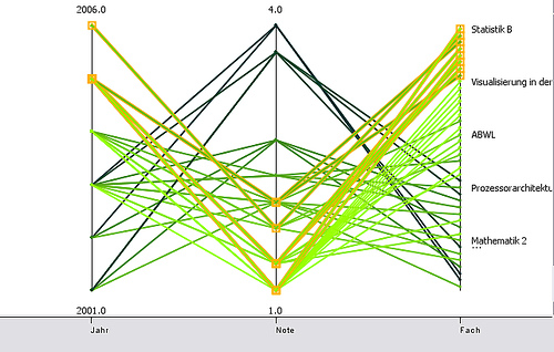
Parallel Coordinate Plot- a graph that displays data in several dimensions. Each variable is graphed on a vertical axis and each data element is plotted as a connected set of points, one on each axis. 


This parallel coordinate plot shows grades received by the author at the University of Konstanz between 2001-2006. The first vertical line is the year variable, with each point being a separate year. The next vertical line is the grade variable, with points represented from 1 to 4. The last vertical line is the subject variable. 

Isopleth

Isopleth- a line on a map connecting points having an equal incidence of a specified meteorological figure. 


This map shows mean annual snowfall in North America. The isopleths connect points that receive equal mean snowfall. The numbers on the lines show what level of snowfall they represent, with snowfall measured in centimeters. 

Index Value Plot

Index Value Plot- a graph that shows the index value for each point, which is the ratio of the value to the total of all the values, instead of a concrete number. 


This index value plot shows the shift in ocean temperatures from 1900-2008. Orange values are above average temperatures, and blue values are lower than average temperatures. The article with this graph argues that changes in ocean temperatures are common and long-lasting, and that a rising ocean temperature is not necessarily related to intense climate change. 

Similarity Matrix

Similarity Matrix- a matrix of scores which represents the similarity between two data points. 


This is a similarity matrix for The Beatles' "Hey Jude". The deep blue parts represent repeating parts, and the lighter and more yellow parts represent dissimilar parts. The matrix is constructed by comparing the similarity of measures of music. 

Digital Line Graph

Digital Line Graph- a format used by the USGS to prepare a digital vector version of a topographic map. 


Digital line graphs can be downloaded for use from the USGS. They display the features from a topographic map in digital form. They are accompanied by a user guide, without which the features are hard to identify and access to their information is limited. This is a DLG of Beaufort, SC.

Star Plot

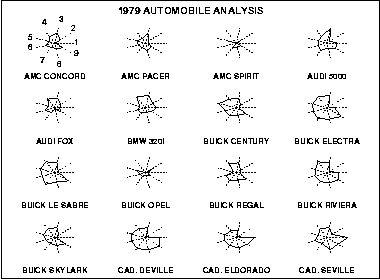
Star Plot- a method used to examine relative values for a single data point. 


A star plot has a sequence of spokes, with each spoke representing one variable. The data length of the spoke is proportionate to the magnitude of the variable. Star plots are often shown with multiple plots in one diagram, to compare observations. This diagram shows 16 star plots for different types of cars. The variables are: 1 price, 2 mileage (MPG), 3 1978 repair record (1= worst, 5= best), 4 1977 repair record (1= worst, 5= best), 5 headroom, 6 rear seat room, 7 trunk space, 8 weight, and 9 length.  

Isobar

Isobar- a line connecting points with the same atmospheric pressure at a given time or the same average over a given period. 


An isobar is another type of isoline. Isobars connect areas with equal pressure, and can help determine areas of high and low pressure. In the map above, the isobars indicate an area with rapidly changing pressure, which led to very high winds across the area. This map is from May 6, 1999, and the website it came from provides an analysis of why the high winds were created. 

DRG

DRG- digital raster graphic- a digital scan of a USGS topographic map. 


A digital raster graphic is a digital image of a scanned paper USGS topographic map. DRGs are used in GIS and mapping applications, and are useful as a backdrop for layering other digital data to check for accuracy. This map is a section of a DRG for Bushkill, PA. 

Weather Map

Weather Map- usually a satellite map with a variety of overlays on it. It will have isobars showing pressure, radar for showing precipitation or clouds, and colorful graphics to make the information easier to understand. 


Weather maps combine many different types of map into one finished product. This map has doppler radar, which shows the precipitation over different parts of the country. The key for intensity of precipitation is at the top. Isobars (the white lines) show areas of equal pressure, but don't really tell you how to read them. The graphic symbols for highs and lows show areas of pressure, and the blue line indicates a cold front. This map contains a lot of information but most of it probably doesn't make sense to the average viewer- only the precipitation is pretty intuitive.

Range Graded Proportional Circle Map

Range Graded Proportional Circle Map- a proportional circle map that uses a set number of circles to convey the magnitude of the data. Each circle corresponds to a geographically distinct area. 


A range graded proportional circle map uses only a set number of circles, while a continuously graded proportional circle map uses an unlimited number of circles to show the differences in data. In a range graded map, the numbers of data are rounded to make each area fit a set circle. This map shows the German population in the Chicago area, but the data is not conveyed as accurately as it would be with a continuously graded map. 

Continuously Graded Proportional Circle Map

Continuously Graded Proportional Circle Map- a map that uses proportional circles to indicate change in magnitude of a factor. The circles come in all sizes to reflect all possible magnitudes of data. 


This map shows the amount of voters by state and metropolitan area who voted for Obama or McCain in the 2008 election compared with those who voted for Bush or Kerry in the 2004 election. There are many different circle sizes- they are not limited to just four or five. The circle is proportionate to the number of voters. 

DOQQ

DOQQ- digital orthophoto quarter quad- an aerial photo that has been digitally corrected so that the scale is uniform and is has the same lack of distortion as a map.


The biggest difference between a DOQQ and a standard aerial image is that the distortion inherent in an aerial photo has been removed. A DOQQ starts with an aerial photo, which is then georectified to eliminate distortion caused by camera tilt and terrain relief. DOQQs can be used as the base for other maps, while aerial photos should not be used for base maps. 

LIDAR

LIDAR- light detection and ranging- a remote sensing technology that uses laser scanning to collect height or elevation data. 


This LIDAR image shows an area where a coastal landslide occurred. A LIDAR view was taken from each of the six numbered locations in the image, and then compiled to get the current image. The colored areas show where the landslide occurred, and the colors represent elevation. Blue is the highest and red is the lowest. 

Isoline Map

Isoline Map- a map containing lines that join points of equal value. 


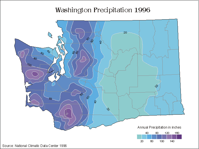
An isoline map contains any type of isoline, which joins points of equal value. Types of isolines include isotachs, isopleths, and isohyets. This map contains isolines that join points of equal precipitation. All the points are mapped and then joined by the lines, and the area in between lines is shaded to show how much precipitation it received. 

Sunday, April 17, 2011

Choropleth Map

Choropleth Map- a map that uses predefined differences in shading or coloring within predefined areas to indicate the average values of a property or quantity within those areas. 


A choropleth map uses a color scheme to show differences in a variable that is being mapped. Most choropleth maps only display one variable at a time, and can be made on any scale- country, state, county, etc. This map shows the acres of hay harvested across the US, with the scale being by county. The darkest counties have the highest harvest, and the lightest counties have the lowest.