Thursday, April 14, 2011

Proportional Circle Map

Proportional Circle Map- displays data in relation to the size of circles on the map. Usually used to convey numerical data. 


A proportional circle map uses circles of proportional sizes to convey information about data shown in the map. The circles represent numerical values, such as population, occurrence of lightning strikes, or amount of people using alternative transportation. A formula will be used to determine the size of each circle based on the numerical value. Generally bigger circles = a higher number. Here the circles show the Hispanic population of each state, not as a percentage of overall population but as a finite number. In my opinion this map could have been made more informative and readable by making the starting circle size bigger, so that more of a difference could be seen more easily. 

Isopach

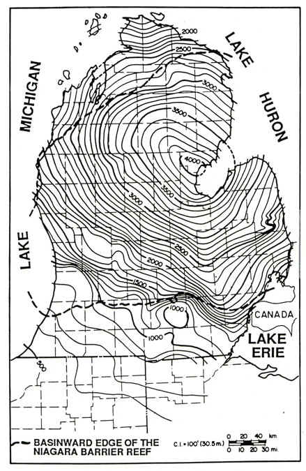
Isopach- a line on a map connecting points of equal thickness in a stratigraphic layer. Used to indicate rock thickness. 


Isopach maps are used in stratigraphy, sedimentology, structural geology, petroleum geology, and volcanology. Connected lines indicate points of equal thickness, similar to isobars or isotachs. This map shows Michigan in a stage of rock development. The thickest rocks occur at the bay where the 4000 is located, and the thinnest rocks occur at the southernmost edge of the state. This map is from the Silurian period of sedimentary rock development. 

Scatterplot

Scatterplot- a relational chart that displays the X,Y coordinates on a grid. The correlation of the point helps to determine a trend in the data. 


Here hours of study and test scores are plotted on a graph, with each point representing one person or test. Each point is charted independently on the graph, from which a conclusion can be drawn. Because the point show a positive relationship between more hours of study and higher test scores, it can be assumed that studying more will positively affect the test score. If the points were more randomly distributed, it would be harder to come to a conclusion, or the conclusion might be that more hours of study does not affect the test score. 

Wednesday, April 13, 2011

Histogram

Histogram- a bar chart representing a frequency distribution. A histogram is different from a bar graph because in a histogram the bars must all touch each other so that the measured data measurements on the x-axis are continuous. 


This is a (made up) histogram of the salaries of employees of a big-box chain. The chart starts at the lowest salaries and moves in even increments of $10,000 up to $200,000, above which everything is grouped together. It shows that the largest group of employees is getting paid the lowest salary, the managers (presumably of individual stores within the chain) are getting paid an average salary and there are far less of them than of the lowest employees, and the top executives, who are the smallest group, are getting paid the most. It is a histogram because the frequencies are represented with bars and the x-axis variable moves evenly upwards. Even though this chart is made up, in my opinion it is a fairly accurate representation of the compensation methods of a company like this. 

Cadastral Map

Cadastral Map- a map depicting land parcel boundaries. 


This is a map of the District of Columbia from 1917 showing government buildings, all other buildings in the mall area, and public lands. From the map it is easy to tell how the early center of Washington D.C. was divided into a grid system, and then parceled out into smaller pieces. This map does not include all of the information that might be found on a cadastral map, though, such as portion and plan numbers and parish and county names and boundaries. 

Population Profile

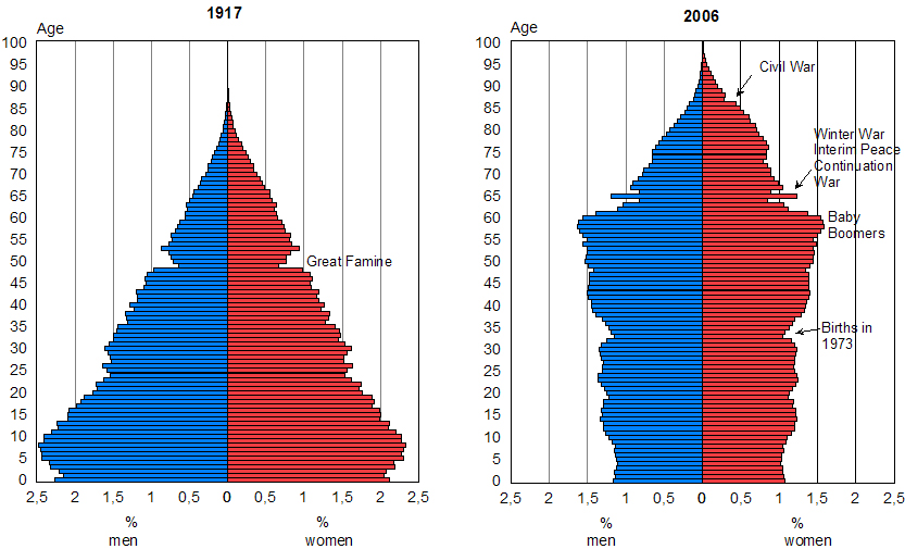
Population Profile- a chart showing the number of people as a function of their ages- also called a population pyramid. 


A population profile shows the number of people in each age group within a country. Here, the profile shows each age group as a percentage of the total population, instead of as a calculated number. They are always divided into male and female populations. From a population profile, it is possible to discern events that have affected the population of the country. This is a profile of Finland, with two different years shown. A label points to the Great Famine, showing how the population from that time is significantly smaller. Other labels show the Baby Boom generation as a rise in the total number of people and the subsequent decline in birth rates as a smaller percentage of the population. 

Windrose

Windrose- a diagram indicating compass directions on terms of eight principal winds. 


Windrose is the original name of the compass rose, which is used to indicate direction on maps. This windrose shows the directions of the eight major winds- Tramontana, Gregale, Levanter, Sirocco, Ostro, Libeccio, Poniente, and Mistral. Winds were used to determine crop-growing seasons and for navigation of trade ships around the Mediterranean.