Wednesday, April 13, 2011

Planimetric Map

Planimetric Map- a map that shows the horizontal locations and distances of figures, without regard for elevation. 


A planimetric map shows only 2-dimensional features of an area. Here, the map shows the country of Iceland, with rivers, cities, towns, and states. What it does not show is elevation, like mountains, valleys, hills, or other 3-dimensional features. 

Topographic Map

Topographic Map- a map that gives locations of man-made features as well as contour lines at different levels to show valleys, hills, and other features of the area. 


http://mapsof.net/uploads/static-maps/topographic_map_of_the_uk.jpg


In this map of the United Kingdom, the emphasis is on the topographic features of the area. The mapmaker has included some political elements, such as borders of countries and locations of cities, but the majority of the information is physical. The key at the top left shows what elevation each color corresponds to. Even though it looks like the northern areas of England have very high elevations compared to the southern areas, the maximum elevation shown in the map is still less than 1,000 ft. 

Monday, March 28, 2011

Box and Whisker Plot

Box and Whisker Plot: a graphic representation of a set of data that shows the median, average, and measures of dispersion. 


A box and whisker plot provides a visual representation of numerical data, and makes it easy to determine outliers in the data. This plot shows the page count of Wired Magazine in relation to the December page count, which is the line horizontal line through the center. By noting how far removed (or not removed) from the center line the box is, the viewer can determine how many more (or less) pages were in each issue. As can be seen from this plot, every other issue had less pages than the December issue, with November being the closest contender in page number.  

Flow Map

Flow Map: a map that shows, by proportionally varying width of lines, the amount of traffic or flow within the network.


As can be seen from the map, the amount of asylum seekers coming to the USA can be compared to other continents by comparing the width of the arrows. South America and the Caribbean are the smallest, followed by Europe, and Asia and Africa seem to be about equal. As an example of a flow map, this map is very functional, but as a stand-alone resource it is not- what years does it show? What kind of asylum seekers does it show- just those from war, or from other issues as well? Can the width of the arrows be directly related to a number?

Friday, January 21, 2011

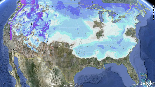
Satellite Map with Political and Isopleth Elements

Satellite Map: photograph of Earth made by means of artificial satellites.
Political Map: a map that includes a country's boundaries, territories, and capital.
Isopleth: a line or curve connecting points of equal value.


This map shows the snow present in 49 of the 50 states on January 11, 2011. The base of the map is a satellite photo of the United States, with the political boundaries of the country and its states added on top. Isopleths show the distribution of snow, and the spaces in between isopleths were filled in with colors to show the depth of the snow. Although not specifically labeled on the map, it can be inferred that the deeper colors show where the deepest snow is. Florida was the only state that did not have any snow, although, as can be seen from the map, it came inching very close to the border of Florida and Georgia. 

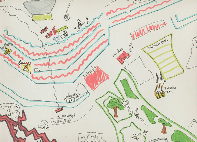
Mental Map

Mental Map: a map that represents the perceptions and knowledge a person has of an area. 


This is a mental map of Amsterdam, the Netherlands, drawn by a homeless man. It shows a small area of the city, presumably the area he spends most of his time in. He has included details of personal experiences, such as the first time he got in a fight and where a riot occurred. A simple, line-drawn style is used to represent familiar areas, and color is used not to convey information but to show emphasis on certain places. The map is part of a project conducted by the Nottingham Psychogeographical Unit to compile a mental map of Amsterdam from different people.